Next: 6. Miscellaneous Up: R4RAF Previous: 4. More Details About
Variance spectra are also plots and perhaps belong in the preceding chapter, but they are discussed here in greater detail than the preceding plots and so seemed to fit better in a separate chapter.
The plots discussed here as “variance spectra” are often referred
to as “power spectra.” That term is not used here because the
spectra representing variance in the data.frame measurements from
NCAR/EOL/RAF netCDF files are not power. Even in the case of wind
(with variance dimensions
 ), the
variance spectrum is better described as a kinetic-energy spectrum.
For this reason, the plots discussed in this chapter will be called
“variance spectra” and the plotted quantity will be called the
spectral variance.
Consider the cumulative distribution function for variance
 ,
the fraction of the variance that is contributed by frequencies smaller
than
 . The differential distribution function with respect to
frequency is then

 starting with the specific variable
 . The differential distribution function would then be
 specified by

 thus gives the spectral density in terms of
 and so in terms of
 .
In the following, two options for variance spectra are emphasized:
 vs
vs
 on a linear plot and
 vs
vs
 with a logarithmic abscissa and either a linear or logarithmic ordinate
scale. These are regarded here as “proper” displays because the
area under segments of the plotted curves represent contributions
to the variance so it is possible to estimate the contributions to
variance from various intervals in frequency by using the areas on
the plot. This direct representation is compromised in the case where
the variable
 is plotted on a logarithmic scale because
then it is necessary to consider the logarithmic ordinate when evaluating
areas. This minor inconvenience nevertheless is less significant than
the problems that arise from using a linear ordinate scale, in which
case the ordinate range obscures relationships and the common “
 ”
slope seen in logarithmic plots becomes a parabolic line that is difficult
to interpret. For that reason, plots of spectral variance here will
emphasis plots of
 vs
vs
 on log-log scales.
It is suggested that plots of
 vs
vs
 on log-log scales
should be avoided because the connection between area on the plot
and variance is lost, making the plot harder to interpret. In addition,
“
 ” spectra are steep, the range of ordinate values is higher,
and the plots are therefore more difficult to interpret than those
plotting
 vs
vs
 on a log-log scale.
The function “Ranadu::VSpec()” includes three methods that can be selected to estimate the spectral variance:
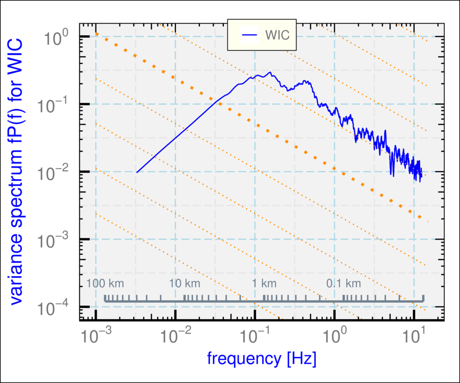
See “?Ranadu::VSpec” for details regarding using this function. The essential inputs are a data.frame that includes at least the variables “Time”, “TASX”, and the variable for which the variance spectrum is desired. TASX is needed to interpret the scale both in terms of frequency and wavelength. An example is shown in Fig. 5.1, using the default specifications.
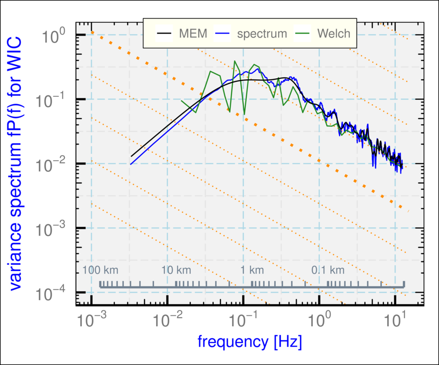
The following demonstrates how to combine plotted spectra. The three
lines on this plot were generated using the three methods of spectral
estimation available in VSpec(), all for the WIC variable:
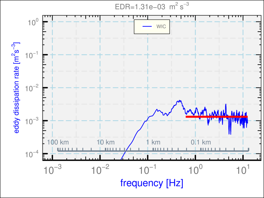
Another option that may be of use, although the result is not a “proper”
spectrum in the sense used above, is to plot with weighting by
VSpec('WIC') + theme_WAC()

Rmutate(WIC2=WIC, WIC3=WIC) ## duplicate the variable
g <- VSpec(D, 'WIC', VLabel='spectrum')
g <- VSpec(D, 'WIC2', method='Welch', VLabel='Welch',
segLength=128, smoothBins=50, add=g)
VSpec(D, 'WIC3', method='MEM', VLabel='MEM', add=g) +
theme_WAC()

 and additional change of variables so that the resulting ordinate
matches the eddy dissipation rate in a case where the measurements
are indeed from an inertial subrange. Figure 5.3 illustrates
this plot. The variable plotted is
 ,
with
 the airspeed and
 for lateral spectra; this quantity
should equal the eddy dissipation rate in an inertial subrange.
